How to make the footer start at the bottom of the screen with Tailwind CSS
December 19th, 2021

Let's demonstrate the problem by creating an header and footer in Next.js _app.js file - which is usually a great location to place your layout code as Next.js applies that to all pages.
Demonstrating the problem using Next.js
While this is using Next.js to demonstrate, the solution can be applied to any framework of choice - you just need it in the layout component.
import '../styles/globals.css';

const App = ({ Component, pageProps }) => {
  return (
    <>
      <div className="mx-auto py-4 flex justify-center bg-blue-900 text-white text-lg font-bold h-16">
        HEADER
      </div>
      <Component {...pageProps} />
      <div className="mx-auto py-4 flex justify-center bg-blue-900 text-white text-lg font-bold h-16">
        FOOTER
      </div>
    </>
  );
};

export default App;
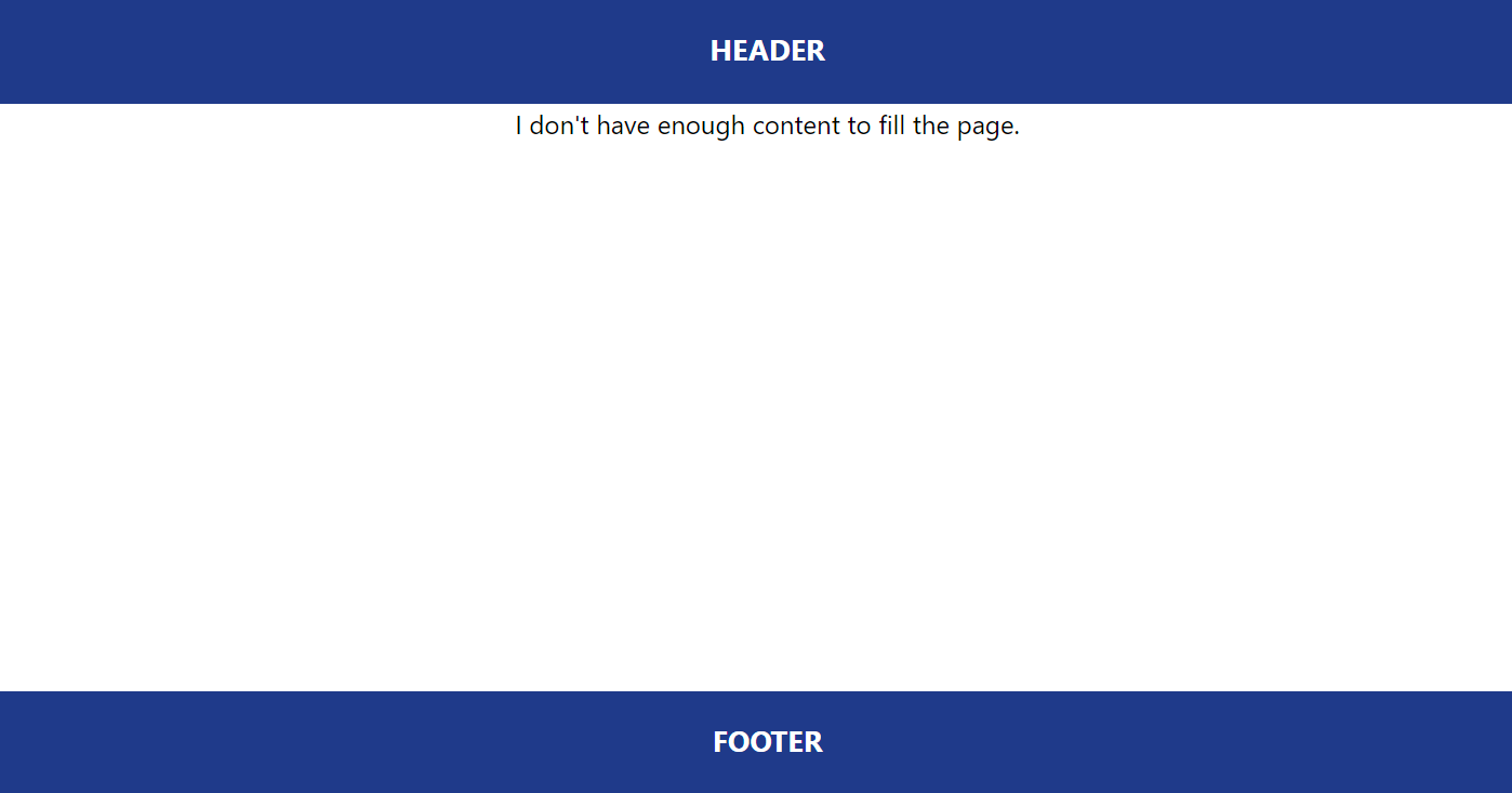
And lets just add some content to the index.js inside the pages directory of Next.js - the only thing here is make sure you don't have sufficient content to fill the entire screen.
import Head from 'next/head';

const Index = () => {
  return (
    <>
      <Head>
        <title>Footer at bottom with Tailwind CSS</title>
      </Head>
      <main className="max-w-7xl mx-auto flex justify-center">
        <p>I don't have enough content to fill the page.</p>
      </main>
    </>
  );
};

export default Index;
And if you run the app and go to the root page...

Not quite the result we want, but easily solvable with Tailwind CSS!
How to solve the footer problem
To solve the problem we need to make use of Tailwind's screen utility classes and turn our layout into a flex layout.
First wrap the entire content with a div that applies the min-h-screen class - you can probably guess what that does. It looks like below, we are also defining a column based flex flow.
<div className="min-h-screen flex flex-col">
Then wrap the Components tag - the body section - with the flex-grow tailwind css class.
<div className="flex-grow">
    <Component {...pageProps} />
</div>
flex-grow will allow the body section to grow to fill available space - and since we have the min-h-screen class applied to the entire content - the footer is always going to stay where it needs to be - at the bottom of the browser screen - until of course content grows beyond the screen.
The complete changes look like this...
import '../styles/globals.css';

const App = ({ Component, pageProps }) => {
  return (
    <div className="min-h-screen flex flex-col">
      <div className="w-screen mx-auto py-4 flex  justify-center bg-blue-900 text-white text-lg font-bold h-16">
        HEADER
      </div>
      <div className="flex-grow">
        <Component {...pageProps} />
      </div>
      <div className="w-screen mx-auto py-4 flex justify-center bg-blue-900 text-white text-lg font-bold h-16">
        FOOTER
      </div>
    </div>
  );
};

export default App;
Conclusion
Tailwind is CSS done right...my opinion anyway. Quite obviously this isn't a new problem and using component libraries or raw css are other ways to skin this one, but with Tailwind CSS you get the flexibility to quite seamlessly apply effects like this to your own styled components.