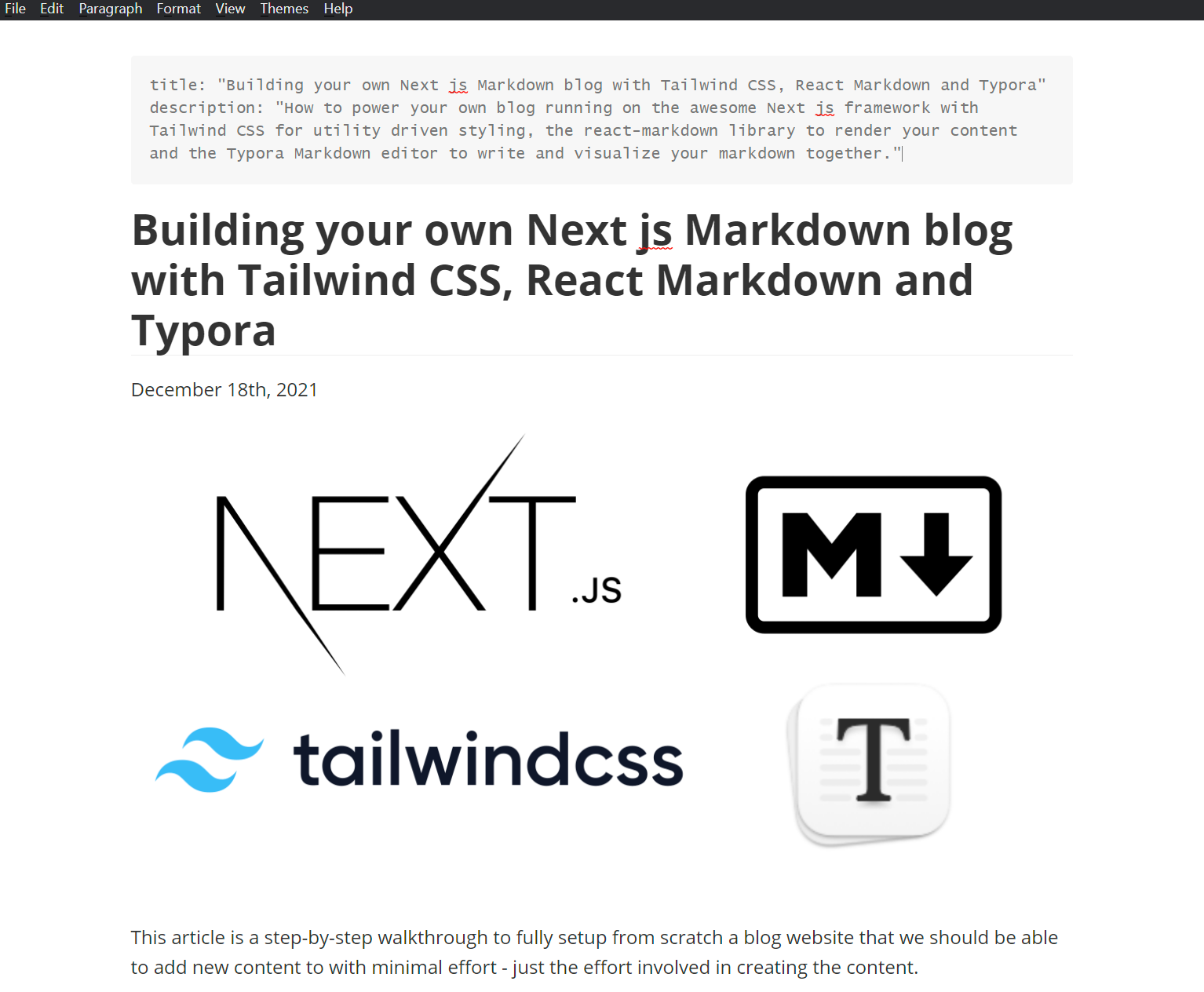
Building your own Next js Markdown blog with Tailwind CSS, React Markdown and Typora
December 18th, 2021
This article is a step-by-step walkthrough to fully setup from scratch a blog website that we should be able to add new content to with minimal effort - just the effort involved in creating the content.
Certainly, there are options to use services that have done all of this work for you, but with just a little upfront effort, building your own gives you far more control over your work, may turn out to be more cost effective...and is definitely far more fulfilling!
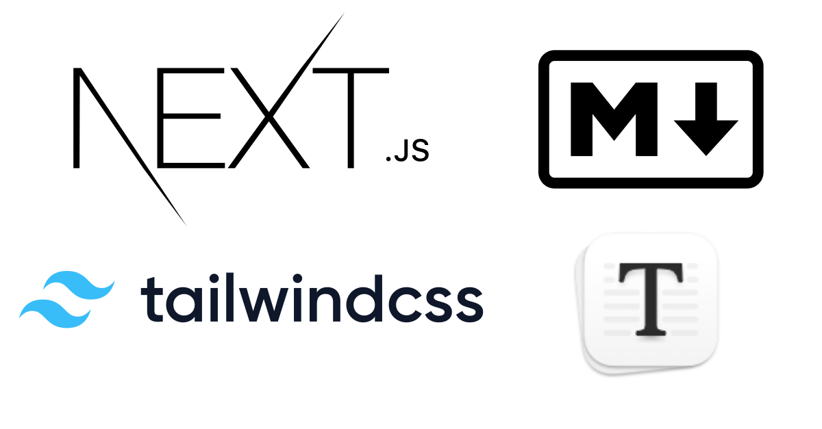
But certainly, for a build-your-own-blog to become an actual live site and not just a learning exercise, it needs to be relatively quick to setup, easy to make customizations and absolutely seamless to quickly add content. I believe using the tools highlighted here in the title and image above will allow us to come out ahead in this goal. A quick overview of these tools in case you aren't familiar and why I chose them before we dive into the work.
Next.js
A framework, an awesome framework, for building statically generated sites using React.
Next.js will allow us to quickly build a an almost typical single-page-application and seamlessly setup navigation routes without any additional libraries and complex wiring that a regular React site would need. It has all the goodies already built to add new content pages so easily.
Far more importantly, unlike React, Next.js will statically generate all our pages - turning our single-page-app into a regular web app - great for SEO which is kind of essential for a blog.
Tailwind CSS
Tailwind CSS is what took away my fear of website design. While I did dabble with CSS, never really liked it until I started using Tailwind, and now I never need to see a CSS class again in my life.
Utility first CSS frameworks like Tailwind is the only way to go if you want to do design quickly. With tailwind we will be able to quickly apply and test different styles in the same context as the JavaScript layout code - you get things done much quicker.
If you haven't used Tailwind before, I promise you will love it.
We will also use Tailwind's Typography cousin library - remember, we want to be on auto pilot once we set things up and Typography has great prebuilt styling for content so we don't need spend time on that.
Markdown
If you are unfamiliar, markdown is a language or framework for writing and styling content that can easily be rendered into HTML. We will use Markdown to create our content and meta data for it, frontmatter so to speak, and use the react-markdown library to render it into Next.js pages.
But I personally am not a fan of writing Markdown, many people find it very productive, but learning the syntax aside, I really dislike the context switching between writing my content and then reviewing the look of it.
And that's why I highly highly, did I say highly, recommend the product below.
Typora
Typora is a Markdown editor that lets you visualize your Markdown content as you write it - it completely hides the Markdown from you.
It is my secret sauce in churning out content quickly. You see how your content is coming along as you type, you can add with images, and even code blocks inline, and I personally find myself much more efficient using Typora than context switching between Markdown to actual layout.
Typora isn't free, but I recommend giving it a whirl with a trial - it is only $15 for a license - worth so much more for the time it has saved me personally.
What about complex React Components, Code Styling, MDX?
You can render complex React Components with React Markdown which we will be using in this guide.
All the code styling in this very post uses react-syntax-highlighter for the rendering straight from the plain markdown ".md" content.
This however is not going to be covered in this already long guide, it really needs its own post. I will touch upon that later.
I am not a personal fan of working with MDX, more of stylistic preference - the same reason I prefer working with Typora over raw Markdown - I like to see code separate from my prose. But MDX too I will cover in later articles.
With that overview done, lets get started with getting this all setup.
Installing a Next.js application with Tailwind CSS bootstrapped
Next.js provides a quick way to get it setup with all the required basic Tailwind configurations preconfigured. Lets do that, pick a suitable name for your blog as you follow this guide.
$ npx create-next-app --example with-tailwindcss markdown-blog
Open the folder in an editor like Visual Studio Code to see your setup. There is very little manual tweaking needed if any - everything really is preconfigured for you with a sample index.js page showing an example layout using tailwind utility classes for styling .
This guide is not going to cover the explanations of React, Next.js or Tailwind and the setup, but whatever we are going to do, we will certainly cover the how and the why and should be enough to follow along with some basic familiarity with React jsx.
For now, just a reminder that anything you add under the "pages" folder, Next.js is going to helpfully generate a html page for us there. Lets add an about page and run our starter blog. Under the pages folder, add a file called "about.js".
markdown-blog/pages/about.js
//markdown-blog/pages/about.js
const About = () => {
  return (
    <>
      <main>About</main>
    </>
  );
};

export default About;
And lets also go ahead and clean up the starter index.js page that was created for us - helps to start with a blank slate which we are going to build out incrementally.
//markdown-blog/pages/index.js
const Index = () => {
  return (
    <>
      <main>Index</main>
    </>
  );
};

export default Index;
Now run the application using the command below from the root directory - in my case it is "markdown-blog" using the command below.
npm run dev
There isn't much to see yet, but navigate to the following links should show you our Index and About pages.
This is one of the cool things about Next.js - simply adding a "page-name.js" is going to create a new page for us without any wiring on our part.
In fact if you are familiar with what is needed and are happy with manually adding blogs written up min React jsx files with manual links to those in the index.js page, you could stop right here! You are all set already!
But follow along - we will get to that auto pilot state where we don't need to do this stuff manually and are adding content with Typora and rendering those Markdown files, with the index page automatically getting updated - like a real blog is supposed to.
And yes we are going to work with Tailwind too, which our current setup doesn't even use.
Installing Tailwind's cousins - Typography, Headless UI, Hero Icons
Typography, as mentioned earlier, we are going to use to ultimately style our blogs. Headless UI and Hero Icons are libraries that we are going to use to create a responsive Navigation bar on the top - kind of like what this blog has.
These are all from the creators of Tailwind and I personally consider them part of the same package, but the creators of Tailwind have them available as separate installs to use if you really need them - which is fair.
npm install @headlessui/react
npm install @heroicons/react
npm install -D @tailwindcss/typography@latest
There is only one addition we need to do to the tailwind config after this - which is to add the Typography plugin to the exports.
//markdown-blog/tailwind.config.js

...
...
plugins: [require('@tailwindcss/typography')],
Creating an initial Navigation bar component
Lets start from the very top of our blog - the Navigation bar - which we want reusable and visible in all pages. We are going to use the Headless UI Disclosure component to build this.
Using Disclosure I acknowledge is not the best Tailwind introductory example. But I want to use this because we can get a responsive navigation bar setup much easier with it. And the perks if this is new to you, once you get this built and understand what is happening here, you have yourself a template for extending and styling your menu components for any other site.
Full details are in the docs, but I will explain the short version with the menu example here.
The Disclosure component at its simplest - lets you define a panel to show/hide sections on the page. It exposes it state prop so we can make use of that to style things - the prototypical example would be an open/close button depending on the state of the panel.
This makes is the perfect component for a responsive navigation menu where we could...
- Show a regular menu across the top when the screen is wide on a desktop or tablet
- Show a mobile friendly menu button that can be expanded or collapsed on a small screen
Lets build this in parts. First create a Components folder - a place to store components that we could reuse on other pages. Then lets create a Menu.js component there like below.
//markdown-blog/pages/Menu.js
import { Disclosure } from '@headlessui/react';
import { MenuIcon, XIcon } from '@heroicons/react/outline';
import Link from 'next/link';

const Menu = () => {
  return (
    <Disclosure as="nav" className="bg-gray-100">
      {({ open }) => (
        <>
          <div className="max-w-7xl mx-auto relative h-16">
            See where I start
          </div>

          <Disclosure.Panel className="sm:hidden">
            <div></div>
          </Disclosure.Panel>
        </>
      )}
    </Disclosure>
  );
};

export default Menu;
We have a simple menu that is returning a Disclosure component as an HTML nav tag. We have started to make use of Tailwind as well and are doing 3 things.
- Setting a gray background color
- Setting the width and height of the menu container using Tailwind CSS' predefined utility classes. Specifically max-w-7xl is a great default max-width to work with and you will notice most modern sites in the web use that.
- We have hidden the <Disclosure.Panel> tag for all screen sizes greater than "small" - this is how Tailwind media breakpoints are done, if you want something to apply to medium and large screens, you prefix the property with "sm:" - so it takes effect if the width is > small. If you want something for large screens only, the prefix is "md" and so on. In this case the panel is only visible to mobile screens
Using _app.js for the Blog layout and adding the Navigation bar to it.
We will be coming back to nav bar next. First we need some place to import our Navbar and have it render in any page.
Creating a Layout page in a regular React application is an involved undertaking, to which you will usually use the router library and spend a lot of time wiring stuff.
Not so with Next.js.
The _app.js that is already created for you is the perfect layout page since it is shared by all pages when Next.js does its static generation magic. For us - we just want to place our nav bar above the Component definition and that is it.
//markdown-blog/_app.js
import '../styles/globals.css';
import Menu from '../components/Menu';

const MarkDownBlog = ({ Component, pageProps }) => {
  return (
    <div>
      <Menu />
      <Component {...pageProps} />
      {//you can add a footer here to display below every page}
    </div>
  );
};

export default MarkDownBlog;
Now you should see a fascinating grey menu bar in the Index and About pages with the "See where I start" text to indicate what limit max-w-7xl sets.
Making the Navigation bar mobile friendly
OK, time to change up the navigation bar. We are going to
- Add text to indicate we want to navigate to Index and About - these will not be actual links until the next section.
- Show a normal menu in wide screens that will get hidden when the screen is small.
- Show an expandable menu button in mobile screens that will be pinned to the top left.
- Expanding menu will show our menu items
- We will show a close icon when the menu is expanded using the disclosure "open" state which will close the expanded menu on click
- Set some minimal styling to the menu
This is how its done below.
//markdown-blog/pages/Menu.js
import { Disclosure } from '@headlessui/react';
import { MenuIcon, XIcon } from '@heroicons/react/outline';
import Link from 'next/link';

const Menu = () => {
  return (
    <Disclosure as="nav" className="bg-gray-100">
      {({ open }) => (
        <>
          <div className="max-w-7xl mx-auto relative h-16 relative flex">
            <div className="absolute inset-y-0 left-0 flex items-center sm:hidden">
              <Disclosure.Button className="inline-flex items-center justify-start text-black">
                {open ? (
                  <XIcon className="block h-8 w-8" />
                ) : (
                  <MenuIcon className="block h-8 w-8" />
                )}
              </Disclosure.Button>
            </div>
            <div className="hidden sm:flex space-x-8 items-center justify-start font-semibold text-black">
              <div>Index</div>
              <div>About</div>
            </div>
          </div>

          <Disclosure.Panel className="sm:hidden">
            <Disclosure.Button as="div">Index</Disclosure.Button>
            <Disclosure.Button as="div">About</Disclosure.Button>
          </Disclosure.Panel>
        </>
      )}
    </Disclosure>
  );
};

export default Menu;
Might seem like a lot - but if you look at it carefully - we are creating a div for the Disclosure Button that is set to the top left and displays one of 2 icons depending on the state. It's corresponding Menu items are defined in the panel <Disclosure.Button as="div">Index</Disclosure.Button>. And we have another Div below the Disclosure Button section that simply holds two plain divs for the menu items Index and About.
Everything else is styling using Tailwinds, Flex boxes, heights, text weight, alignment...and to hide/show them depending on screen sizes.
Adding Next.js Links to the Nav Bar
The raison d'etre for any menu bar - to provide links to navigate.
Let's give our own menu component a reason to exist by using Next.js Link components.
Again if you are familiar with React - routing is a non trivial setup - and frankly a pain. This is quite painless in Next.js and something I never quite understand why the React Framework Team does not support out of the box, but that is a separate discussion.
Simply wrap the Index and About texts/divs in the Menu.js file to use the Next.js link which should be intuitive seeing this below.
...

<div className="hidden sm:flex space-x-8 items-center justify-start font-semibold text-black">
    <Link href="/">
        <a>Index</a>
    </Link>
    <Link href="/about">
        <a>About</a>
    </Link>
</div>

...

<Disclosure.Button as="div">
    <Link href="/">
        <a className="font-semibold text-black">Index</a>
    </Link>
</Disclosure.Button>
<Disclosure.Button as="div">
    <Link href="/about">
        <a className="font-semibold text-black">About</a>
    </Link>
</Disclosure.Button>

...
And now we have a responsive menu with Links that work in both wide and mobile screens.
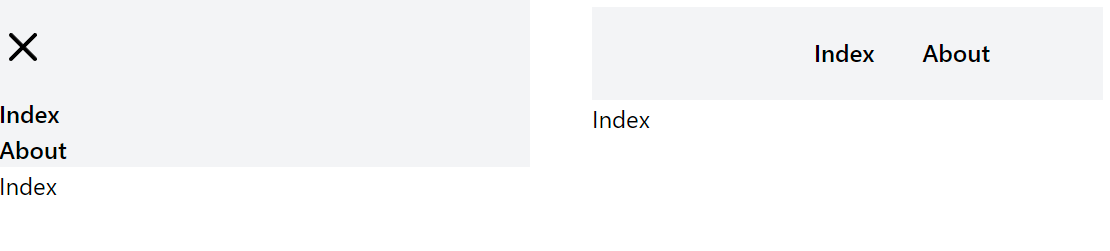
Not pretty, but functional - for now that is good.
Creating dynamic Next.js pages with a [slug].js file
It doesn't need to be named [slug].js but in order to create dynamic pages in Next.js, a page needs to be created with the square brackets enclosing the name - like [id].js.
This is typically named "slug" because that what it is - a the url "slug" of your blog posting.
But that is exactly what this page is used for - we want a way to dynamically generate pages with urls for our Blog content, without having to define a new page for each one...and Next.js makes this trivial...comparatively anyway if you are building your own.
Again, we are not going to get into the gory details of how Next.js works its magic - the short version...
-
Inside your [slug].js page - give Next.js a list of "slugs" - urls that need to get generated.
- These slugs are how you want the url to be formed - passing "how-to-create-a-markdown-blog" will result in a valid page that can be reached by accessing http://localhost:3000/how-to-create-a-markdown-blog
-
Define a common Layout in the default export function of the [slug].js. Typically this is going to look like...
return{ <> <head>{//placeholders for head stuff here - title description}</head> <main>{// placeholders for the actual blog content }</main> </> } -
Create a function which Next.js can provide the slug...the url...to and in return get the specific content it needs to render on the page.
The two magic functions that Next.js needs us to define are the getStaticPaths function for list of slugs, and getStaticProps for the dynamic content. The word static gives an indication that Next.js generates these pages at build time - static generation and all.
We are first going to make our [slug].js work with some hard coded content before making it a more realistic implementation reading our Markdown files. Let's do this now.
//markdown-blog/pages/[slug].js

import Head from 'next/head';

//define this to return the paths - list of slugs - your blog posts
const getStaticPaths = async () => {
  const paths = [
    {
      params: {
        slug: 'blog-post-1',
      },
    },
    {
      params: {
        slug: 'blog-post-2',
      },
    },
  ];

  return {
    paths,
    fallback: false,
  };
};

//define this to return specific blog conent to next-js
//and remember to return all you need back - this will go the default function.
const getStaticProps = async ({ params }) => {
  const slug = params.slug;

  let title = 'Blog Post 1';
  let description = 'First Blog Post';
  let content = 'This is the First Blog Post';

  if (slug === 'blog-post-2') {
    title = 'Blog Post 2';
    description = 'Second Blog Post';
    content = 'This is the Second Blog Post';
  }

  return {
    props: {
      title,
      description,
      content,
    },
  };
};

//render your dynamic content here
const Slug = ({ title, description, content }) => {
  return (
    <>
      <Head>
        <title>{title}</title>
        <meta property="description" content={description} />
      </Head>
      <main className="max-w-7xl mx-auto">
        <div className="prose max-w-none">{content}</div>
      </main>
    </>
  );
};

export default Slug;

//it will not work unless you export these two.
export { getStaticPaths, getStaticProps };
The two things to note that I did not explain earlier -
- We are using Next.js' Head component to easily define the HTML head section.
- We are using Tailwind Typography - that is the "prose" utility class for the content.
The content itself is hardcoded to return 2 blog posts which you should now be able to access by navagating to
The above page hopefully already has demystified the process for you a lot.
We just need to now have a way to give the list of slugs and the content to Next.js dynamically.
- Look at all the markdown files we have saved.
- pass those file names back to getStaticPaths as the slugs - stripping out the .md extension
- Get a slug from Next.js, read the file, and return the contents of the file back.
- Render the Markdown content as HTML on the page.
And that is what we are going to do in the next few sections - starting with creating the Markdown.
Creating Markdown files with Typora ... just see the first part if you are uninterested.
Before you skip this section and grab/write your own Markdown first...do this:
- Create a "content" folder in the root directory.
- Save your Markdown files there.
- Create a "img" folder in /public directory - this is where we can reference images in markdown by using the relative /img/image-name.png in our Markdown file samples. Just replace the image name with one of yours.
If you plan to try Typora -
Also create an "img" folder inside the Content directory
- This is so the /img/name references to images will work while you are working with Typora and you will be able to see your images as you insert them.
- The actual site will of course pick up the images directly from the public/img/ directory - where we need a copy of the image.
- Typora has workarounds for this scenario like formatting each image and providing the website path and all - but I find it much simpler and quicker to drop my images in two locations.
We just need to do one more thing -> Typora Preferences -> Check use relative url if possible. This will ensure your markdown is saved with the /img/filename pattern which will work for your actual pages as long as you insert images from that location.
And that all there is to it really - you should be able to type your content as you see with a standard text editor style menu...right along side all the shortcuts of the Markdown format and no visual context switch.
Lets create some sample Markdown for our blog post using Typora that looks like this below. Note the section with the title and description can be inserted from File -> YAML Frontmatter.
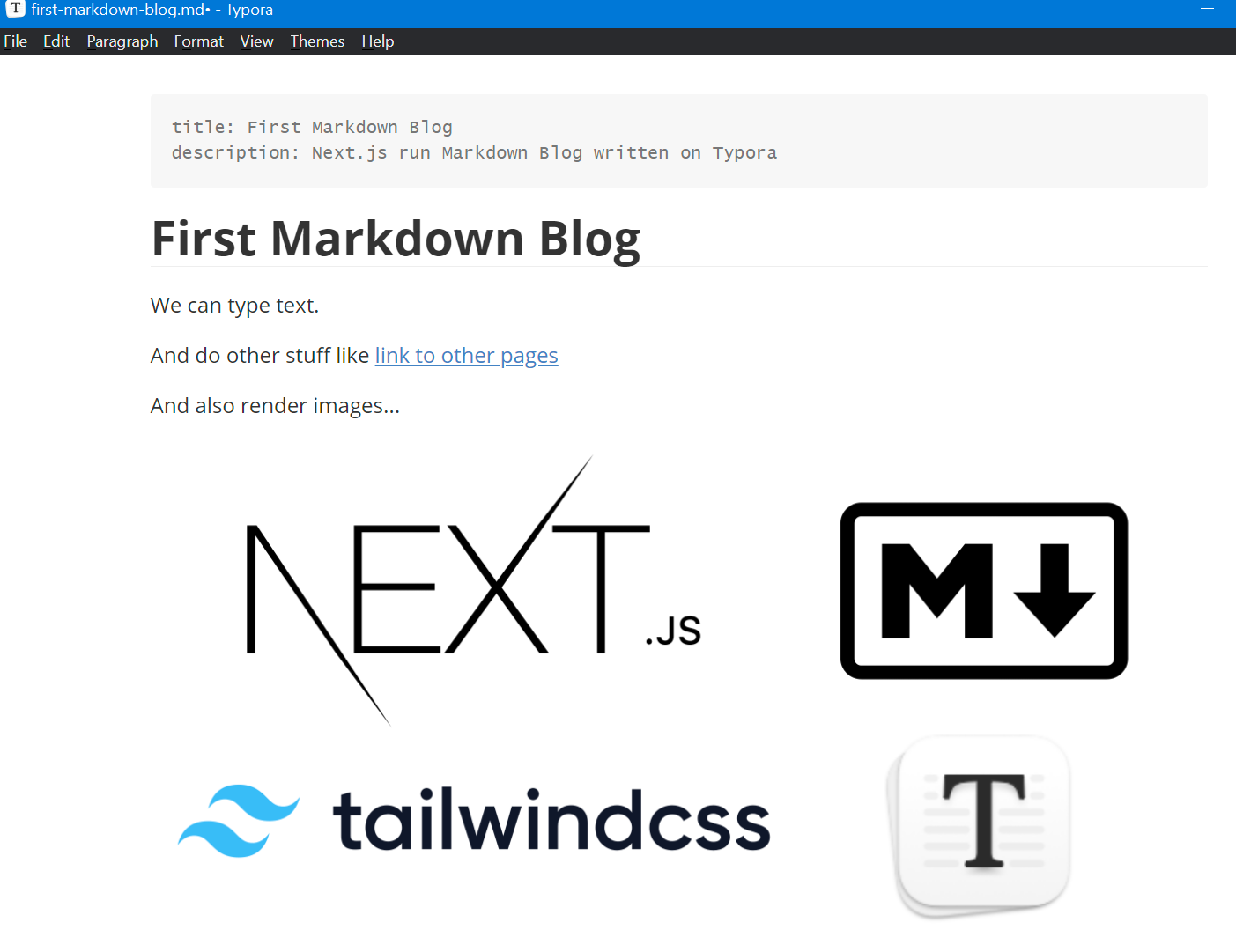
Insert content or any image you feel like of course.
The resulting Markdown you should be able to view in your code editor like Visual Studio Code.
--- title: First Markdown Blog description: Next.js run Markdown Blog written on Typora --- # First Markdown Blog We can type text. And do other stuff like [link to other pages](http://localhost:3000/about) And also render images... 
Reading Markdown Frontmatter and Content using GrayMatter
So the anatomy of a Markdown file is two sections - the Frontmatter and the Content.
The Frontmatter is of critically useful importance, besides just storing the title and description like we have for this guide - you can define anything else you want here.
Inspect the head section of this actual blog page and review all the head content defined to get an idea - this is all stuff I usually add to the frontmatter - like the og:image and such.
Please be aware, these sections are not in scope for this already long guide and I will cover those in detail later, but it is something you can easily add as you need.
Now when we return this content back to [slug].js page component - we need to separate the Frontmatter from the Content - for obvious reasons - we want to show the content on the page, but use the frontmatter in other ways.
For this we are going to use a library called GrayMatter
npm install gray-matter
Lets do all our file parsing work in a separate library.
Create a libs folder and a file called md-parser.js. Lets first use GrayMatter to take in a slug and extract and return the front matter and content.
//markdown-blog/libs/md-parser.js
import fs from 'fs';
import path from 'path';
import matter from 'gray-matter';

const contentDir = path.join(process.cwd(), 'content');

const getContent = async (slug) => {

  const fullPath = path.join(contentDir, `${slug}.md`);

  const fileContent = fs.readFileSync(fullPath, 'utf8');

  const { data: frontmatter, content } = matter(fileContent);

  return {
    frontmatter,
    content,
  };
};
We will be replacing our hard coded content in the [slug].js file with a call to this function. But first, lets implement something that will also supply dynamic slugs to the getStaticPaths function in this same file, and lets also not forget to export these two functions.
const getSlugs = () => {

  const fileNames = fs.readdirSync(contentDir);

  return fileNames.reduce(function (result, fileName) {
    if (fileName !== 'img') {
      result.push({
        params: {
          slug: fileName.replace(/\.md$/, ''),
        },
      });
    }
    return result;
  }, []);
};

export { getContent, getSlugs };
Ignore the img directory, strip out the .md extension and return that as our url.
Adding the dynamic content to the [slug].js file
We are approaching the end, but just a few more things to do.
First, lets rewrite our [slug].js to use the two functions we just wrote.
//markdown-blog/pages/[slug].js
import Head from 'next/head';
import { getSlugs, getContent } from '../libs/md-parser';

const getStaticPaths = async () => {
  const paths = getSlugs();

  return {
    paths,
    fallback: false,
  };
};

const getStaticProps = async ({ params }) => {
  const slug = params.slug;
  const { frontmatter, markdown } = await getContent(slug);

  const siders = await getSiderSlugs();

  return {
    props: {
      slug,
      frontmatter,
      markdown,
      siders,
    },
  };
};

...
...
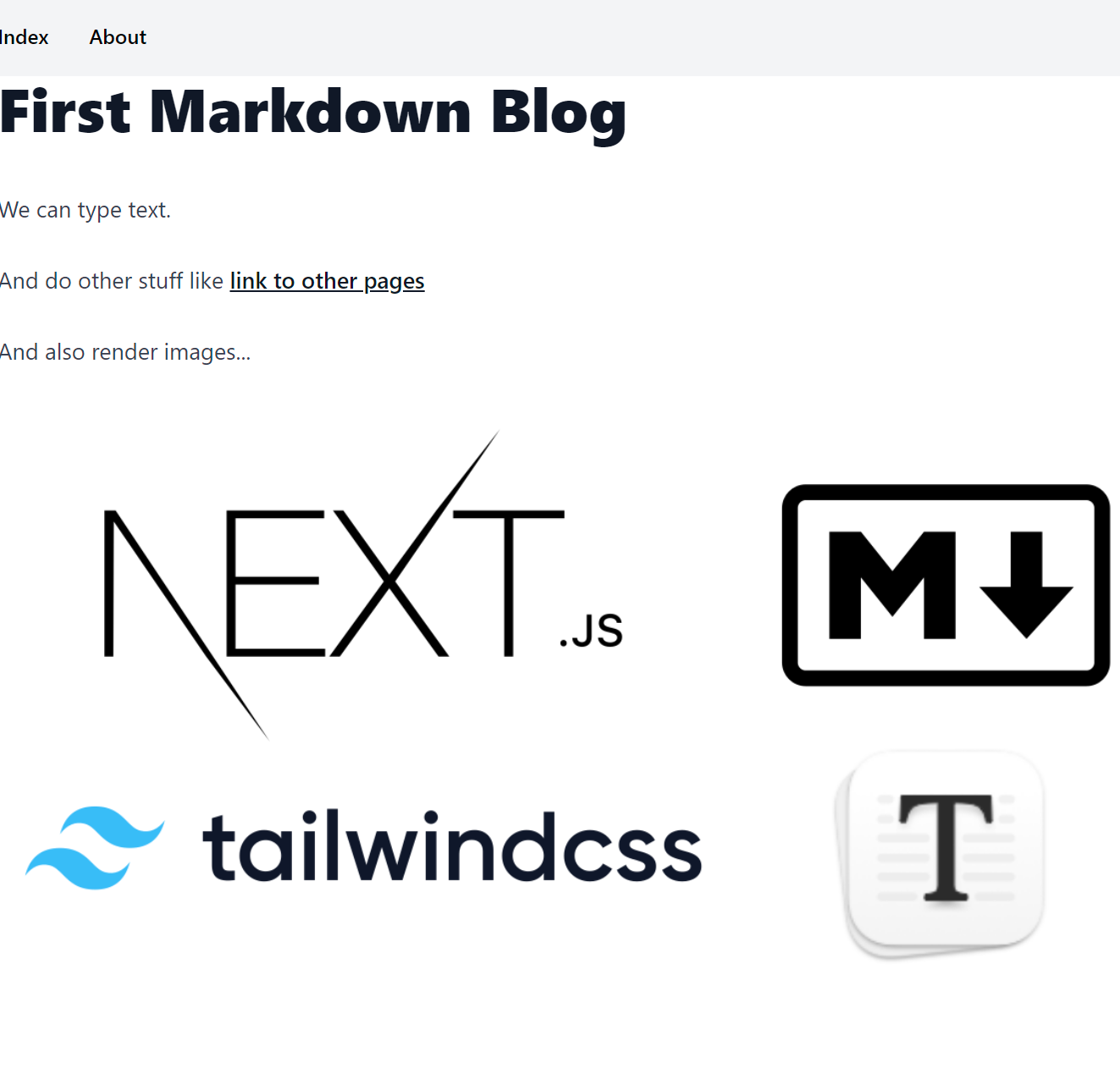
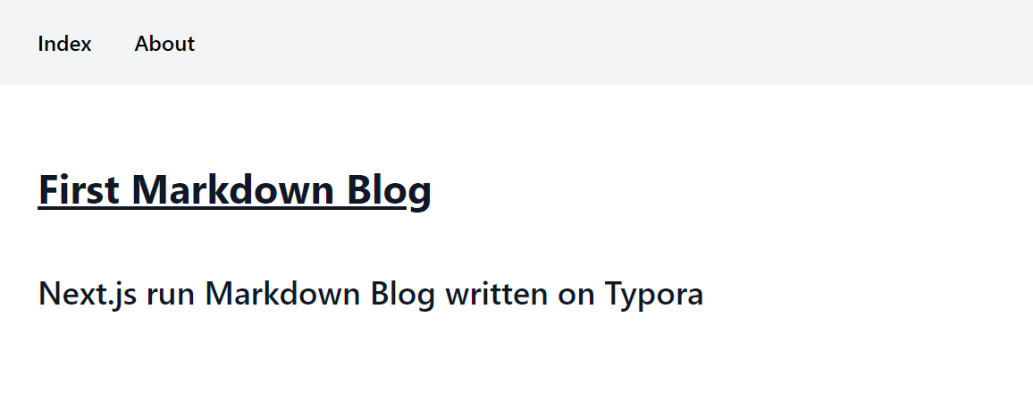
If you navigate to http://localhost:3000/first-markdown-blog, you should now see a single line of text for content...
# First Markdown Blog We can type text. And do other stuff like [link to other pages](http://localhost:3000/about) And also render images... 
So far so good - next stop - rendering that to actual HTML.
Rendering Markdown to HTML using React Markdown
Lets grab the powerful React Markdown library, and also a related plugin that we can use with that - Remark GFM - adds support for more Markdown formatting like strikethroughs and such - no reason not to use it really for future needs.
npm install react-markdown
npm install remark-gfm
And then, lets pass our content to react-markdown like so.
//markdown-blog/pages/[slug].js
...
...
import ReactMarkdown from 'react-markdown';
import gfm from 'remark-gfm';
...
...
const Slug = ({ title, description, content }) => {
  return (
    <>
      <Head>
        <title>{title}</title>
        <meta property="description" content={description} />
      </Head>
      <main className="max-w-7xl mx-auto">
        <article className="prose prose-lg max-w-none">
          <ReactMarkdown remarkPlugins={[gfm]}>{content}</ReactMarkdown>
        </article>
      </main>
    </>
  );
};
And the result... http://localhost:3000/first-markdown-blog
Clearly can use some formatting with paddings and such - all of which can be easily extended with Tailwind CSS in tags like these...
<main className="max-w-7xl mx-auto">
        <article className="prose prose-lg max-w-none">
But that is not going to be in scope for this particular article, I will cover other Tailwind related posts later.
We do have one more important piece of work left - to list our content in the Index Page.
Listing Blogs in the Index Page
For the Index page - we don't need the content, however we do need the Frontmatter to show the Blog Posts and perhaps the description. And we need all the titles.
If you are using this as a base for an actual blog - do make use of the frontmatter to get the other relevant content you may need - author, date and such.
This is the function that you can use however as a base from which you can do other things like sorting by date and so on.
//markdown-blog/libs/md-parser.js

...
...
const getBlogs = async () => {

  const fileNames = fs.readdirSync(contentDir);

  const blogs = fileNames.reduce(function (result, fileName) {
    if (fileName !== 'img') {

      const fullPath = path.join(contentDir, fileName);

      const fileContent = fs.readFileSync(fullPath, 'utf8');

      const { data: frontmatter } = matter(fileContent);

      result.push({
        slug: fileName.replace(/\.md$/, ''),
        frontmatter,
      });
    }
    return result;
  }, []);

  return blogs;
};

export { getContent, getSlugs, getBlogs };
And now, lets revisit and rewrite our Index.js page...
//markdown-blog/pages/index.js
import Head from 'next/head';
import { getBlogs } from '../libs/md-parser';
import Link from 'next/link';

const getStaticProps = async () => {
  const blogs = await getBlogs();

  return {
    props: {
      blogs,
    },
  };
};

const Index = ({ blogs }) => {
  blogs.map((blog) => {
    console.log(blog);
  });

  return (
    <>
      <Head>
        <title>Markdown Blog</title>
        <meta property="description" content="Index Page" />
      </Head>
      <main className="max-w-7xl mx-auto">
        {blogs.map((blog) => {
          return (
            <div className="prose prose-lg max-w-none">
              <Link href={`/${blog.slug}`}>
                <a className="underline">
                  <h2>{blog.frontmatter.title}</h2>
                </a>
              </Link>

              <h3>{blog.frontmatter.description}</h3>
            </div>
          );
        })}
      </main>
    </>
  );
};

export default Index;

export { getStaticProps };
And the result...
We are about done and all the foundations are now there to extend this...and style this of course.
Conclusion
Hope you found the guide, or at least parts of it useful.
The Full Stack blog was built out of a similar foundation outlined here, so it certainly can be taken live - but there is obviously more work involved for next steps - certainly customization and styling - that's the fun part of building your own work - but then there are more necessary items - creating head tags, creating sitemaps, notifying search engines.
All doable...but it is work - before you can then finally start churning out content.
Good Luck on the path.